Launching a Digital-First Church Experience
Designing a Platform to Foster Faith and Community for a New Online Congregation
Role
Lead UX/UI Designer
Industry
NonProfit, Technology
Duration
4 months
Project Overview
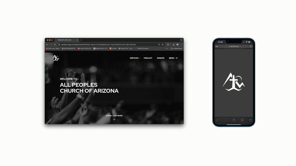
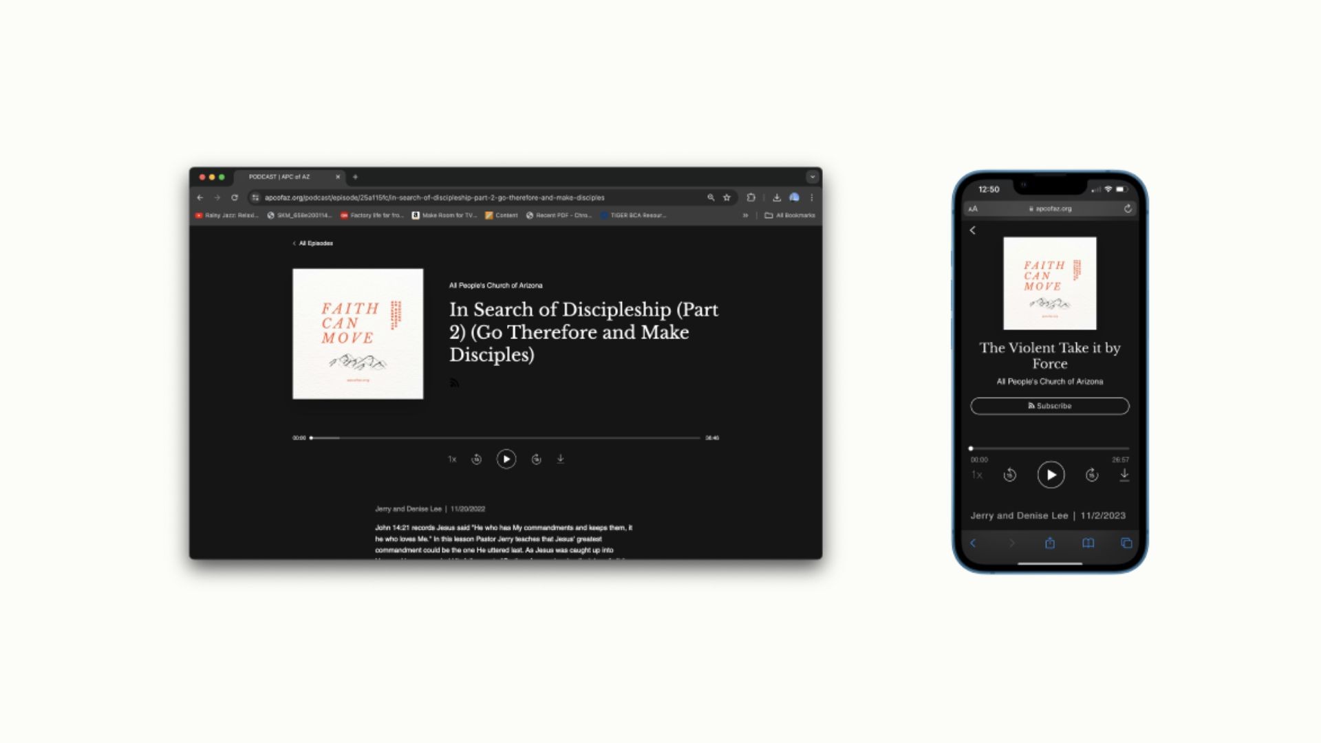
All Peoples Church of Arizona (APCOFAZ) is a brand-new, online-only church seeking to provide a meaningful worship experience for a digital congregation. The project aimed to design a user-friendly website that highlights key features, including a podcast library and a dedicated giving page.
Goals:
Create a seamless navigation experience for users.
Highlight the podcast as a central engagement tool.
Simplify the donation process to encourage giving.
Maintain a clean, inviting design that fosters community and faith.
User Research & Insights
To understand user needs, research focused on online worship trends and website user flows from similar church platforms. Key insights included:
Convenience Matters: Users value quick access to podcasts and giving features.
Mobile-First Access: A majority of the audience accesses content on mobile devices.
Community Engagement: Church members seek opportunities to stay connected between services.
Design Solutions
A. Branding: Logo & Color Palette
Objective: Establish a visual identity that connects APCOFAZ with its northern Arizona roots and modern church community.
Solutions:
Logo: Designed a logo featuring stylized mountains and a church silhouette to reflect the northern Arizona landscape and the spiritual mission of the church. The mountains symbolize stability, faith, and community, while the church represents the church's focus on spiritual growth and gathering.
Color Palette: Chose a simple, clean color scheme using beige, green, grey, white, and black. The muted tones create a calm, peaceful atmosphere, while the green adds a sense of life and connection to nature, further linking the design to the church’s Arizona base.

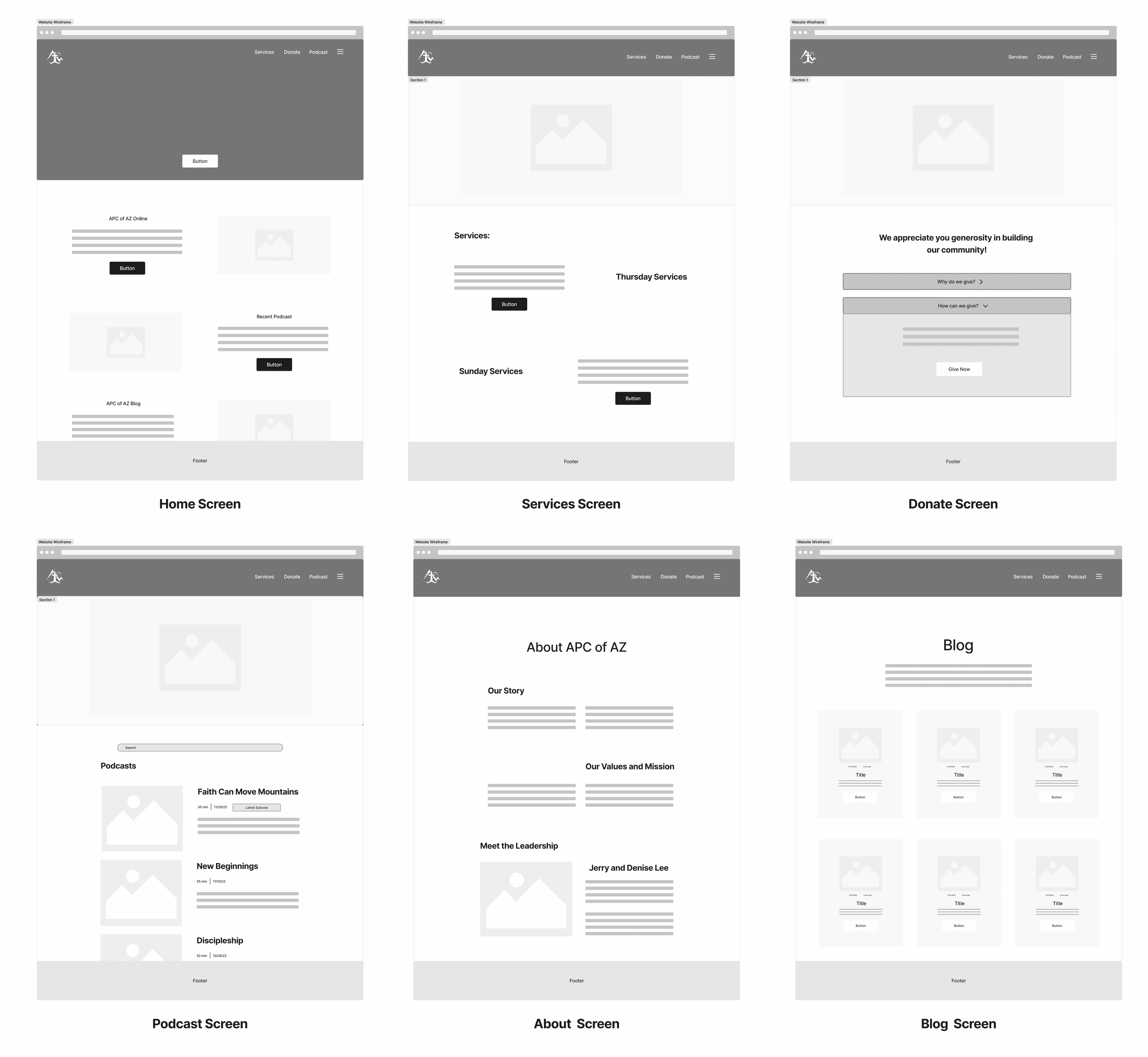
B. Information Architecture & Navigation
Clear Navigation Structure: The website features a simple top navigation with key sections—Home, About, Podcasts, Events, Giving, and Contact—enabling easy access to all essential content.
Intuitive Content Organization: Each section is organized for quick discovery, with dedicated landing pages for Podcasts and Events, helping users find what they’re looking for without unnecessary clicks.
Footer Consistency: A consistent footer across all pages provides easy access to contact details, social media links, and essential church information, streamlining navigation.

Development Process
Wireframing & Prototyping: Developed low and high-fidelity wireframes to map user flows and content organization.
Usability Testing: Tested the design with users to refine navigation and ensure ease of use.
Implementation: Developed the website using a CMS to allow for ongoing content updates and easy management.
Quality Assurance: Conducted cross-device testing to ensure consistency and functionality across different platforms.
Project Overview
All Peoples Church of Arizona (APCOFAZ) is a brand-new, online-only church seeking to provide a meaningful worship experience for a digital congregation. The project aimed to design a user-friendly website that highlights key features, including a podcast library and a dedicated giving page.
Goals:
Create a seamless navigation experience for users.
Highlight the podcast as a central engagement tool.
Simplify the donation process to encourage giving.
Maintain a clean, inviting design that fosters community and faith.
User Research & Insights
To understand user needs, research focused on online worship trends and website user flows from similar church platforms. Key insights included:
Convenience Matters: Users value quick access to podcasts and giving features.
Mobile-First Access: A majority of the audience accesses content on mobile devices.
Community Engagement: Church members seek opportunities to stay connected between services.
Design Solutions
A. Branding: Logo & Color Palette
Objective: Establish a visual identity that connects APCOFAZ with its northern Arizona roots and modern church community.
Solutions:
Logo: Designed a logo featuring stylized mountains and a church silhouette to reflect the northern Arizona landscape and the spiritual mission of the church. The mountains symbolize stability, faith, and community, while the church represents the church's focus on spiritual growth and gathering.
Color Palette: Chose a simple, clean color scheme using beige, green, grey, white, and black. The muted tones create a calm, peaceful atmosphere, while the green adds a sense of life and connection to nature, further linking the design to the church’s Arizona base.
B. Information Architecture & Navigation
Clear Navigation Structure: The website features a simple top navigation with key sections—Home, About, Podcasts, Events, Giving, and Contact—enabling easy access to all essential content.
Intuitive Content Organization: Each section is organized for quick discovery, with dedicated landing pages for Podcasts and Events, helping users find what they’re looking for without unnecessary clicks.
Footer Consistency: A consistent footer across all pages provides easy access to contact details, social media links, and essential church information, streamlining navigation.
Development Process
Wireframing & Prototyping: Developed low and high-fidelity wireframes to map user flows and content organization.
Usability Testing: Tested the design with users to refine navigation and ensure ease of use.
Implementation: Developed the website using a CMS to allow for ongoing content updates and easy management.
Quality Assurance: Conducted cross-device testing to ensure consistency and functionality across different platforms.
Key Design Considerations
Accessibility: High-contrast colors, readable font sizes, and keyboard navigation.
Mobile-First Approach: Fully responsive layouts for easy access on smartphones and tablets.
Consistency: Unified visual design with consistent button styles, font usage, and imagery.
Community Focus: Thoughtful CTAs that encourage spiritual engagement and connection.
Results & Impact
Increased Content Engagement: A 50% increase in podcast plays within the first three months, with the podcast page drawing many new visitors to the website.
Positive Community Feedback: Users praised the calm, welcoming design and ease of navigation.
Improved Navigation: Feedback from users indicated they found key content faster and more easily.
Reflection & Lessons Learned
Successes:
Clear, user-friendly navigation successfully improved the overall user experience.
Consistent branding helped build trust and foster a connection with the community.
Challenges:
Ensuring all content was mobile-friendly while keeping the design aesthetically pleasing was a balancing act.
Future Enhancements:
Implement live streaming for worship services.
Personalize the user experience with tailored sermon recommendations based on listening history.
Add a community discussion feature to encourage more interaction.
Other projects

Pinning Connections: Crafting a User-Centered Design for a Location-Based Messaging App
Building intuitive communication through messages pinned to real-world locations.

BookNest — A Community-Focused Book Discovery and Club App
Designing a seamless reading experience through discovery, organization, and community connection.
Copyright 2024 by Holly Gleason
Copyright 2024 by Holly Gleason
Copyright 2024 by Holly Gleason